
Cover Choices
3 posters
Writers Club Forum :: Off Topic :: Art
Page 1 of 1
![]()
 Cover Choices
![]() by Hazel Mon Jul 18, 2011 2:28 am
by Hazel Mon Jul 18, 2011 2:28 am
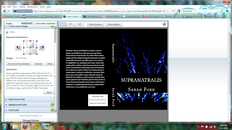
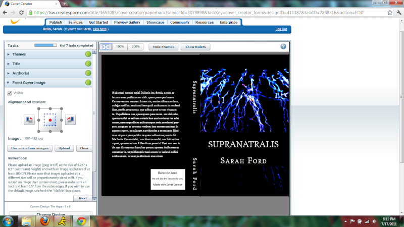
Ok so here they are. They're all screenshots cause that's all I could get D:
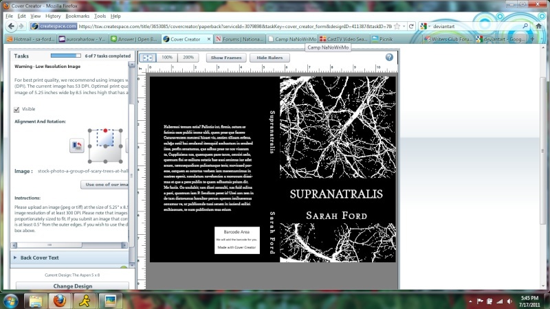
I don't think I like all the white. Too sterile. Like it's a sciency/mediciny book or something. It just looked...clean, which I liked
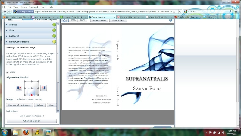
I took this picture myself <3 All the same, looks awfully busy to me
I love these colors <3 too bright for a book I think though
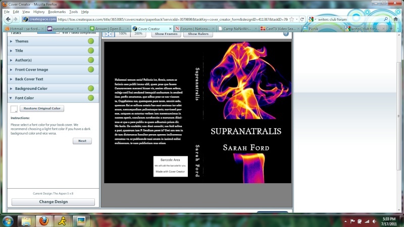
Same as last, different colors

I think I like this as terms of color the best
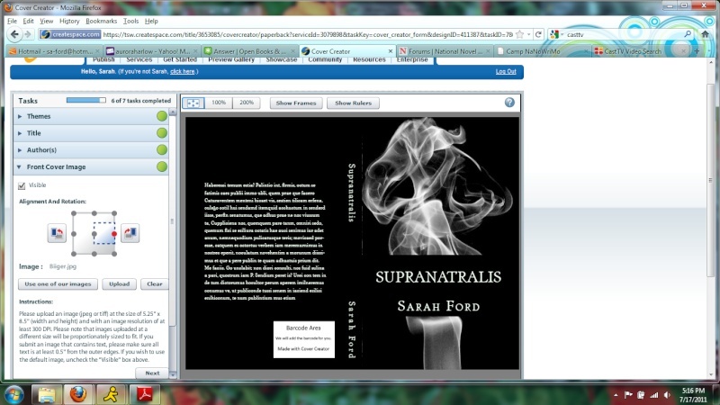
I am also fond of this one. The thin whispy smoke looks nice.
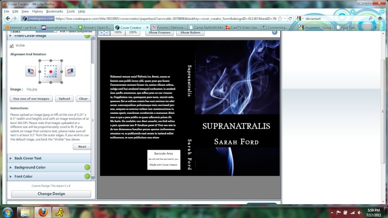
And this one, well it just looked cool
Hey look Google Chrome! this site kept freezing firefox hahaha Anyways, same picture as last but in a different position
Soooo yeahhh. That's what I have for now. I'm still working a bit, not finding much of anything that stands out as brilliant. Hopefully this person making one for me will do a good job and I won't have to use any of my lame ones haha.
So, which is your favorite? Any other ideas I could use on a supernatural cover other than whispy smoke things?
I don't think I like all the white. Too sterile. Like it's a sciency/mediciny book or something. It just looked...clean, which I liked
I took this picture myself <3 All the same, looks awfully busy to me
I love these colors <3 too bright for a book I think though
Same as last, different colors
I think I like this as terms of color the best
I am also fond of this one. The thin whispy smoke looks nice.
And this one, well it just looked cool
Hey look Google Chrome! this site kept freezing firefox hahaha Anyways, same picture as last but in a different position
Soooo yeahhh. That's what I have for now. I'm still working a bit, not finding much of anything that stands out as brilliant. Hopefully this person making one for me will do a good job and I won't have to use any of my lame ones haha.
So, which is your favorite? Any other ideas I could use on a supernatural cover other than whispy smoke things?
Hazel- Moderator
-

Number of posts : 11563
Age : 112
Points :


Points 2.0 : 10202
Registration date : 2008-04-10 -

![]()
![]()
Re: Cover Choices
![]() by Holleh Mon Jul 18, 2011 2:48 am
by Holleh Mon Jul 18, 2011 2:48 am
First one: I actually really like the design. I'm a fan of those clean designs with the whispy spiraly stuff. I would pick up a book like that with that cover, but I don't really think it fits your actual book well, ya know? Like I don't get the vibe that it's a supernatural book or anything. I get more of a mysterious, obscure feel, which is nice, but I'm not sure that's what you want to go for.
Second: I personally don't like black and white book covers much. They just don't stand out to me; I'm more for color. Also, as you said, a tad too busy. It doesn't really pop; I personally wouldn't pick it up if I saw it in a store.
Third: I actually love the colors with this one, aha. Though I'm not a fan of where the title is positioned (which can be said for the three as well). I would probably pick this book out if I saw it.
Fourth: I think the colors used for this are even better, and I still love the whispy design thing. I actually think this is one of my favorites out of the covers.
Fifth: As I said before, I'm personally not a fan of black and white. xP
Sixth: Ahh, my second favorite. Gives off a haunting, chilling kind of vibe. Great colors, too. Actually, wait... I think it's tied for my favorite. xP Definitely would pick this up at a store.
Seventh: Ehh not really a fan. I like the colors, but the design just seems a bit all over the place. It would grab my attention, but upon further inspection, I'd probably put it down.
Eighth: Also not a fan. Like I don't really get much of a vibe from it. And the space below the name and stuff looks a bit empty and too busy on the top, kind of making it unbalanced.
Hope this helps. ^^;
Holleh- Dang, this user has a lot of posts....

-
Number of posts : 4510
Age : 28
Points :
Points 2.0 : 4583
Registration date : 2009-03-19
![]()
![]()
Re: Cover Choices
![]() by Hazel Mon Jul 18, 2011 2:53 am
by Hazel Mon Jul 18, 2011 2:53 am
That's what I thought about the first as well. I love it, just not for my genre.
I think the sixth is also my favorite.
Three and Four I also like cause I agree, color is nice. <3 I'm just thinking that three is a little too wild.
I think if I end up not liking the one made for me by this nano person, I'm going with six
THANKS for the input!!!
I think the sixth is also my favorite.
Three and Four I also like cause I agree, color is nice. <3 I'm just thinking that three is a little too wild.
I think if I end up not liking the one made for me by this nano person, I'm going with six
THANKS for the input!!!
Hazel- Moderator
-
Number of posts : 11563
Age : 112
Points :
Points 2.0 : 10202
Registration date : 2008-04-10 -
![]()
![]()
Re: Cover Choices
![]() by Hazel Mon Jul 18, 2011 4:03 am
by Hazel Mon Jul 18, 2011 4:03 am
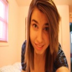
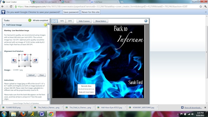
ALRIGHTY! Here are the covers I made for Back to Infernum
1. I don't even like this one.....I have no idea why I bothered putting it up...but yeah ok this is a bad one..moving on

2. This I like, but it seems too busy on the top and not enough on the bottom
3. This one may be a bit bright.....
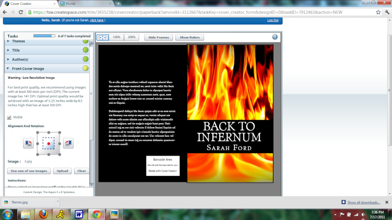
4. I liked it at first...but now looking at it again....hm
5. This one is epic

6. I like this one
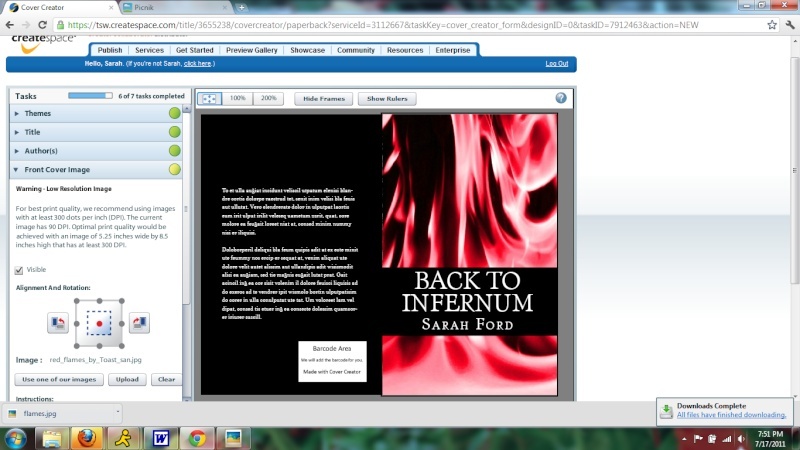
And there you have it! Favorite?
1. I don't even like this one.....I have no idea why I bothered putting it up...but yeah ok this is a bad one..moving on
2. This I like, but it seems too busy on the top and not enough on the bottom
3. This one may be a bit bright.....
4. I liked it at first...but now looking at it again....hm
5. This one is epic
6. I like this one
And there you have it! Favorite?
Hazel- Moderator
-
Number of posts : 11563
Age : 112
Points :
Points 2.0 : 10202
Registration date : 2008-04-10 -
![]()
![]()
Re: Cover Choices
![]() by Holleh Mon Jul 18, 2011 4:27 am
by Holleh Mon Jul 18, 2011 4:27 am
First: Hm I wouldn't say it's bad... Just maybe have more stuff going on on the bottom? I think then it would actually look really good. I would definitely notice it in a bookstore.
Second: Same with this. The top is totally overpowering, which makes it a bit sloppy.
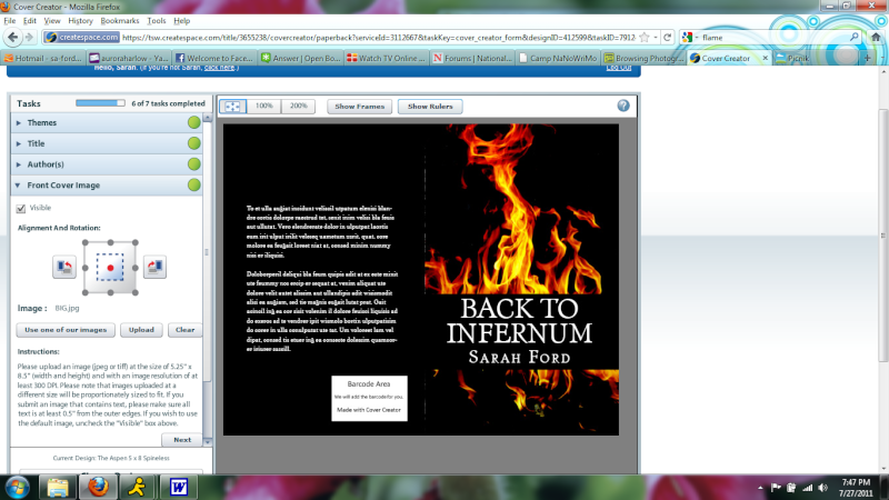
Third: Definitely too bright. xP It'd catch my attention in a bookstore, but then I'd be like "Ehh..." I think the flames are a little too much, too; I personally would like to see more black in that one.
Fourth: Hm.. I like the flames. But the bottom is just... Like it seems balanced but at the same time a bit too much going on. And the way the flames just are cut off by the black space. I would definitely notice this at a store, though.
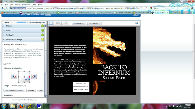
Fifth: I like this one. Nice image, seems balanced. I just don't know if it's my style, though. But it would definitely grab my attention and would have me reading the summary. The only thing I just now noticed is the amount of black space above the dragon... Just seems a bit too empty there. But I dunno... I'm trying to imagine this in actual book form. xP I think it looks fine. I actually take that back about the space thing; I mean, filling the whole thing would be too much, of course. I dunno what I'm saying. Basically, I like it. xD
Sixth: Hm... The flames are a bit too pink for my tastes, honestly. Maybe change the color a bit. The black space near the left looks a bit awkward. I like the concept; perhaps just find a better arrangement of flames.
Second: Same with this. The top is totally overpowering, which makes it a bit sloppy.
Third: Definitely too bright. xP It'd catch my attention in a bookstore, but then I'd be like "Ehh..." I think the flames are a little too much, too; I personally would like to see more black in that one.
Fourth: Hm.. I like the flames. But the bottom is just... Like it seems balanced but at the same time a bit too much going on. And the way the flames just are cut off by the black space. I would definitely notice this at a store, though.
Fifth: I like this one. Nice image, seems balanced. I just don't know if it's my style, though. But it would definitely grab my attention and would have me reading the summary. The only thing I just now noticed is the amount of black space above the dragon... Just seems a bit too empty there. But I dunno... I'm trying to imagine this in actual book form. xP I think it looks fine. I actually take that back about the space thing; I mean, filling the whole thing would be too much, of course. I dunno what I'm saying. Basically, I like it. xD
Sixth: Hm... The flames are a bit too pink for my tastes, honestly. Maybe change the color a bit. The black space near the left looks a bit awkward. I like the concept; perhaps just find a better arrangement of flames.
Holleh- Dang, this user has a lot of posts....
-
Number of posts : 4510
Age : 28
Points :
Points 2.0 : 4583
Registration date : 2009-03-19
![]()
![]()
Re: Cover Choices
![]() by Hazel Mon Jul 18, 2011 4:31 am
by Hazel Mon Jul 18, 2011 4:31 am
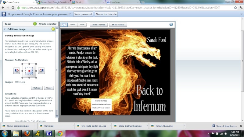
Yeah the fifth is my favorite. I'm just hesitant to put a dragon on the cover because while there will be dragons in it, it's not a huge part of the story so I think it might be misleading.
I love the sixth, but yeah they are a bit pink. I was going for red there. Ah well I'll do some editing and see what I come up with.
I don't have one I completely love yet but I've got time.
I love the sixth, but yeah they are a bit pink. I was going for red there. Ah well I'll do some editing and see what I come up with.
I don't have one I completely love yet but I've got time.
Hazel- Moderator
-
Number of posts : 11563
Age : 112
Points :
Points 2.0 : 10202
Registration date : 2008-04-10 -
![]()
![]()
Re: Cover Choices
![]() by Hazel Thu Jul 28, 2011 4:38 am
by Hazel Thu Jul 28, 2011 4:38 am
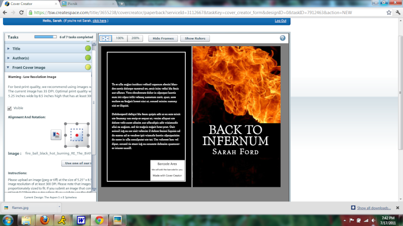
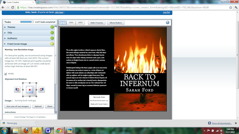
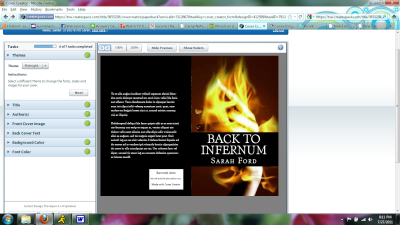
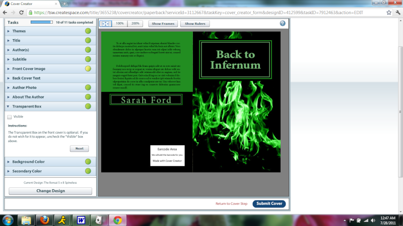
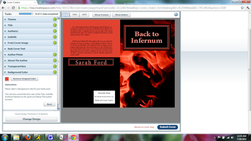
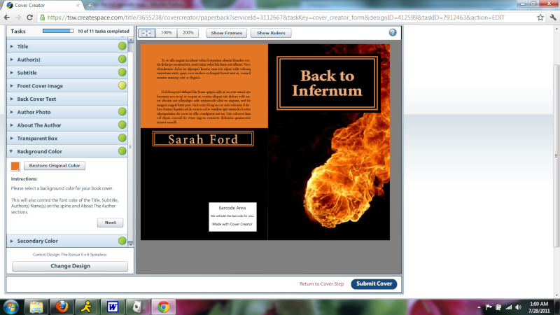
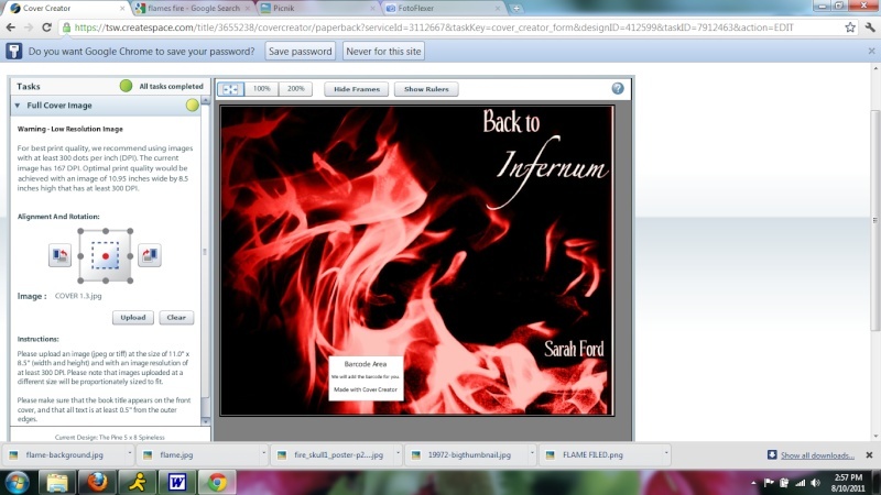
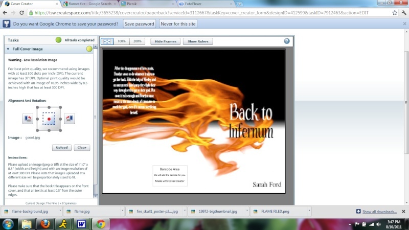
More covers. Yay! I can make the flames any color, so please tell which which colored flames are the best, even if I don't have that color listed on one.
1. I dunno what I think of this yet

2. Same thing but red/orange
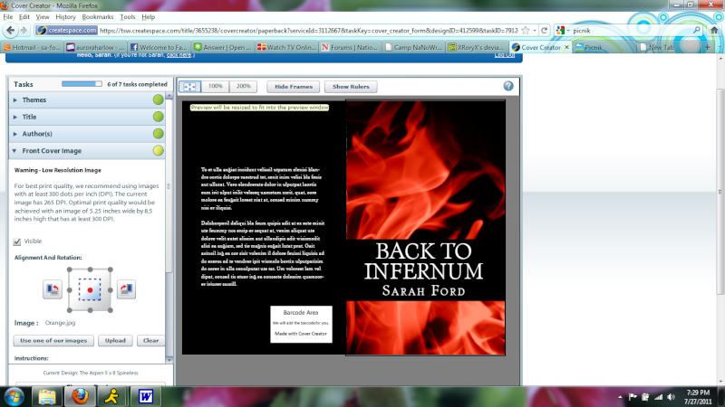
3. Same again but green. This is just positioned differently, it can be the same as the other two
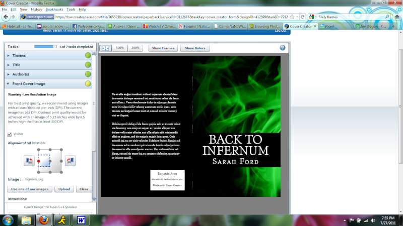
4. I like this flame because it's so crisp looking
5......I.....really don't think I like this one, but I went through the effort of saving it so here it is

6. I love the overall idea of this one, but I haven't decided if I think there's too much black
7. I tried a new concept...don't really like it
8. This one....I think there's too much black
9. I'm not sure this was the theme I was going for, but it does look cool and creepy haha
Annnnd. Yeah. My computer is being slow so it's all I got for now.
1. I dunno what I think of this yet
2. Same thing but red/orange
3. Same again but green. This is just positioned differently, it can be the same as the other two
4. I like this flame because it's so crisp looking
5......I.....really don't think I like this one, but I went through the effort of saving it so here it is
6. I love the overall idea of this one, but I haven't decided if I think there's too much black
7. I tried a new concept...don't really like it
8. This one....I think there's too much black
9. I'm not sure this was the theme I was going for, but it does look cool and creepy haha
Annnnd. Yeah. My computer is being slow so it's all I got for now.
Hazel- Moderator
-
Number of posts : 11563
Age : 112
Points :
Points 2.0 : 10202
Registration date : 2008-04-10 -
![]()
![]()
Re: Cover Choices
![]() by Holleh Thu Jul 28, 2011 8:19 am
by Holleh Thu Jul 28, 2011 8:19 am
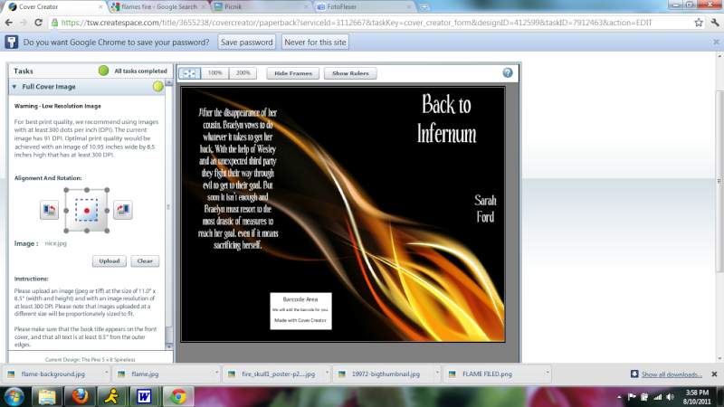
OPINION TIME, YAY.
First: I like it, because I love blue and the whispy things... xD But. My only thing is, if you're going with that one blue one for Supranatralis, it may be too similar. Like I know you want them to match, but I think they'd match too much. But I really like this one nonetheless.
Second: Still like the design, and the colors. This and the first one would both catch my eye in a store, but I'd be more willing to pick up the first one due to the colors.
Third: Really like the coloring and the positioning of this one. Would also most likely pick this up at a store.
Fourth: Hm. I don't hate it, but I don't love it. I don't really like how the top and bottom are cut off, but otherwise, the flames are nice. This would probably catch my eye, of course (the dramatic effect of a bright color contrasted with black usually does), but I don't think it'd draw me in enough to really check the book out.
Fifth: I like the flame, though again it's a bit awkward how it's divided. But I don't think it has that "wow" factor to it. Like the infernum, it's like Hell, right? Kind of? It just doesn't give me that evil impact, that dramatic factor that I think you may want to aim for for this book. I don't think it'd be enough for me to pick it up if I saw it.
Sixth: Really, really nice flame. Just, for me, I dunno, I guess I don't really like flame on black much. Like I love the black, just I'm not one who is super attracted to the flames part (I'm more of a water person xP). I do think this gives it a fierce edge, and it would definitely make me look at it and maybe flip through the pages. While it is fierce, though, I just don't know if it has that "wow" factor, either. Like I don't know, it just seems a bit empty besides the flame, like it's missing something.
Seventh: Hm. I kinda like the image. Oh wait, is that a hand in the flames? Hmm. The brightness would definitely catch my eye, but I'm still not sure it has that dramatic impact to it. I kinda get a creepy vibe from it, though. And the hand kinda looks awkward where it's split.
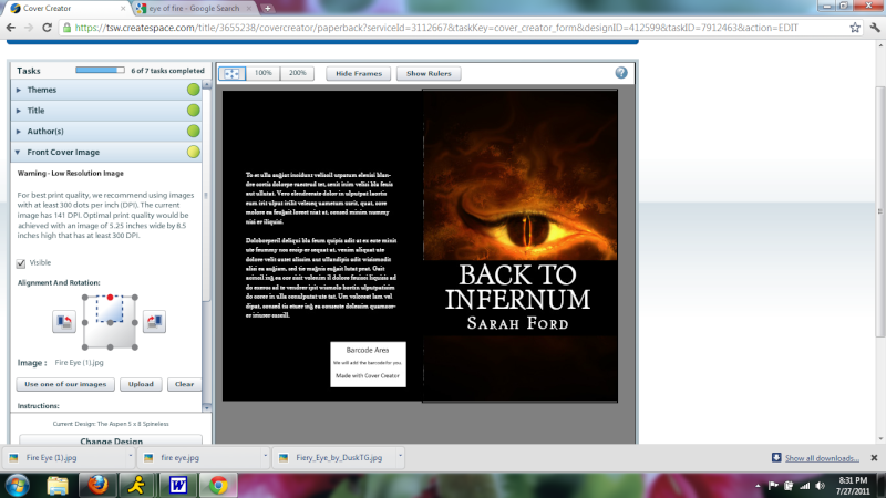
Eighth: Ooh, I like the eye. I just think it's a little too low and not really positioned right. If it was higher up... But then the bottom half, there's like nothing going on and I definitely agree there's too much black. However, that aside, the eye would really draw me in and give me that nice creepy, dark feeling that I find appealing.
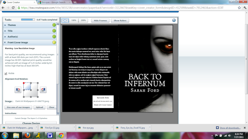
Ninth: I really like this one. It's creepy, dark... But as I've said with the others, the way like the title area cuts it off is just... It really disrupts the image. Also not sure how I feel about the eye area, which to me, is the main focus of this cover. Maybe with a different stock image or something, where the glow of the eye is more prominent and the amount of black is lessened.
Overall, I like your covers, aside from the things I've mentioned. Question, though: Is there any way you could use a different sort of thing for the title and such? Because I feel, if that was changed, they might be improved a bit. Also, just a tip, if at all possible, maybe have something going on for the back? Like the plain black is a little too plain, in my opinion. Though I guess it might be hard to work an image in there with the text, unless the opacity is low, which I think could work nicely.
First: I like it, because I love blue and the whispy things... xD But. My only thing is, if you're going with that one blue one for Supranatralis, it may be too similar. Like I know you want them to match, but I think they'd match too much. But I really like this one nonetheless.
Second: Still like the design, and the colors. This and the first one would both catch my eye in a store, but I'd be more willing to pick up the first one due to the colors.
Third: Really like the coloring and the positioning of this one. Would also most likely pick this up at a store.
Fourth: Hm. I don't hate it, but I don't love it. I don't really like how the top and bottom are cut off, but otherwise, the flames are nice. This would probably catch my eye, of course (the dramatic effect of a bright color contrasted with black usually does), but I don't think it'd draw me in enough to really check the book out.
Fifth: I like the flame, though again it's a bit awkward how it's divided. But I don't think it has that "wow" factor to it. Like the infernum, it's like Hell, right? Kind of? It just doesn't give me that evil impact, that dramatic factor that I think you may want to aim for for this book. I don't think it'd be enough for me to pick it up if I saw it.
Sixth: Really, really nice flame. Just, for me, I dunno, I guess I don't really like flame on black much. Like I love the black, just I'm not one who is super attracted to the flames part (I'm more of a water person xP). I do think this gives it a fierce edge, and it would definitely make me look at it and maybe flip through the pages. While it is fierce, though, I just don't know if it has that "wow" factor, either. Like I don't know, it just seems a bit empty besides the flame, like it's missing something.
Seventh: Hm. I kinda like the image. Oh wait, is that a hand in the flames? Hmm. The brightness would definitely catch my eye, but I'm still not sure it has that dramatic impact to it. I kinda get a creepy vibe from it, though. And the hand kinda looks awkward where it's split.
Eighth: Ooh, I like the eye. I just think it's a little too low and not really positioned right. If it was higher up... But then the bottom half, there's like nothing going on and I definitely agree there's too much black. However, that aside, the eye would really draw me in and give me that nice creepy, dark feeling that I find appealing.
Ninth: I really like this one. It's creepy, dark... But as I've said with the others, the way like the title area cuts it off is just... It really disrupts the image. Also not sure how I feel about the eye area, which to me, is the main focus of this cover. Maybe with a different stock image or something, where the glow of the eye is more prominent and the amount of black is lessened.
Overall, I like your covers, aside from the things I've mentioned. Question, though: Is there any way you could use a different sort of thing for the title and such? Because I feel, if that was changed, they might be improved a bit. Also, just a tip, if at all possible, maybe have something going on for the back? Like the plain black is a little too plain, in my opinion. Though I guess it might be hard to work an image in there with the text, unless the opacity is low, which I think could work nicely.
Holleh- Dang, this user has a lot of posts....
-
Number of posts : 4510
Age : 28
Points :
Points 2.0 : 4583
Registration date : 2009-03-19
![]()
![]()
Re: Cover Choices
![]() by bibbit Fri Jul 29, 2011 2:14 am
by bibbit Fri Jul 29, 2011 2:14 am
I'm diggin' the green one. The design for the first three is cool because it's not HEY LOOK HELLFIRE. It's more abstract. Just do something about the title block as Holleh mentioned and I think that one would look great.

bibbit- Prodigy Writer
-

Number of posts : 1045
Age : 31
Points :
Points 2.0 : 1055
Registration date : 2010-05-13
![]()
![]()
Re: Cover Choices
![]() by Hazel Wed Aug 10, 2011 8:48 pm
by Hazel Wed Aug 10, 2011 8:48 pm
If only I actually could do something about that black bar D: But I can't.
I can try a different cover model though.....there are just a number of things I don't like about this model. Like the color on the back and the fact the author name goes on the back :/
HMM! Well I'm still working on it. Opinions about this model?
I can try a different cover model though.....there are just a number of things I don't like about this model. Like the color on the back and the fact the author name goes on the back :/
HMM! Well I'm still working on it. Opinions about this model?
Hazel- Moderator
-
Number of posts : 11563
Age : 112
Points :
Points 2.0 : 10202
Registration date : 2008-04-10 -
![]()
![]()
Re: Cover Choices
![]() by Hazel Thu Aug 11, 2011 12:00 am
by Hazel Thu Aug 11, 2011 12:00 am
Alright ignore those. Ok now I created some of my own from scratch, without a template of any kind. So see what you can make of these. Oh, and yes it is the whole book, just without the spine and back text.
Different color. I can make it any color btw. So if this would look better in green, I can do that. And I think this one is almost washed out looking.
Same only softer and tinted reddish words. I'm rather partial to this one. The only thing is that it looks more like silk than flame. It looks like a romance novel cover I think.

This one has kind of the cool factor I'm going for.
And this one. I like this one. I think it's my favorite.
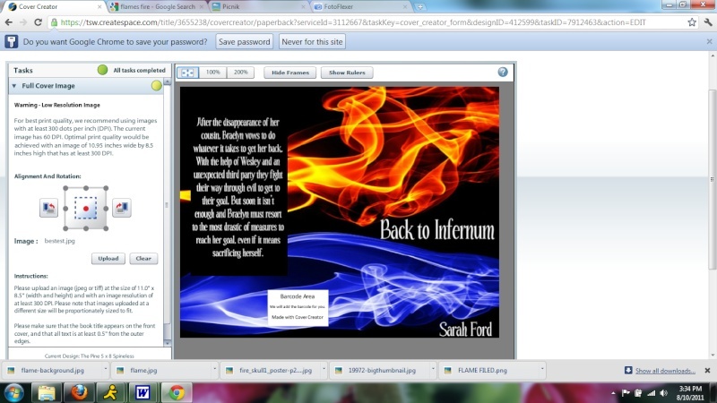
Same thing. Different colors. Actually this one might be my favorite
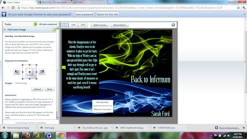
I like the simplicity, but it's not really that interesting....not sure I'd pick it up in a bookstore
This one I also like for simplicity. But I don't really think it's what I'm looking for.....
Different color. I can make it any color btw. So if this would look better in green, I can do that. And I think this one is almost washed out looking.
Same only softer and tinted reddish words. I'm rather partial to this one. The only thing is that it looks more like silk than flame. It looks like a romance novel cover I think.
This one has kind of the cool factor I'm going for.
And this one. I like this one. I think it's my favorite.
Same thing. Different colors. Actually this one might be my favorite
I like the simplicity, but it's not really that interesting....not sure I'd pick it up in a bookstore
This one I also like for simplicity. But I don't really think it's what I'm looking for.....
Hazel- Moderator
-
Number of posts : 11563
Age : 112
Points :
Points 2.0 : 10202
Registration date : 2008-04-10 -
![]()
![]()
![]()
Writers Club Forum :: Off Topic :: Art
Page 1 of 1
Permissions in this forum:
You cannot reply to topics in this forum